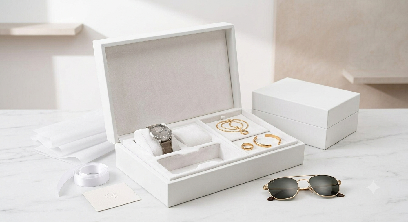
There’s a reason so many premium brands, across completely unrelated industries, converge on the same packaging color. Walk through the unboxing videos of high-end skincare, tech accessories, or designer accessories, and white shows up disproportionately often — not because it’s the safest choice, but because it does something specific that busier, more colorful designs struggle to replicate: it makes the product the only thing worth looking at.
The Restraint That Reads as Confidence
Bold, colorful packaging works hard to earn attention. It uses color contrast, pattern, and visual density to stand out on a shelf. White packaging does the opposite — it wins attention by refusing to compete with the product itself. When a box is stripped of color and pattern, the customer’s eye has nowhere else to go except the logo, the typography, and eventually the product inside. That restraint is a form of confidence: a brand that doesn’t need loud packaging to justify its price is making an implicit claim that the product speaks for itself.
This is part of why white rigid packaging has become so closely associated with premium positioning. It’s not that white is inherently more expensive to produce — often it isn’t — but that using white well requires precision. Any imperfection in print quality, material finish, or construction is far more visible against a plain white surface than it would be against a busy, colorful design. White packaging has nowhere to hide flaws, which means a brand willing to use it is implicitly signaling that its production quality can withstand that scrutiny.
What White Communicates Across Different Categories
| Industry | White Packaging Association |
| Skincare & beauty | Clinical purity, clean formulation |
| Tech accessories | Precision engineering, modernity |
| Fashion & accessories | Minimalism, quiet luxury |
| Gifting | Elegance, versatility for any occasion |
Across all of these categories, the underlying signal is consistent even though the specific association shifts. White doesn’t tell the customer what the brand values through imagery or color psychology the way a bold design does — it tells them through the absence of those things, which customers have learned to read as a marker of confidence and quality.
The Practical Advantage of a Neutral Base
Beyond the psychological signal, white rigid boxes offer a genuinely practical advantage for brands managing multiple product lines or seasonal collections. A white base can be customized with foil stamping, embossing, or a single accent color without needing an entirely new print run for every variation. This gives brands the flexibility to maintain a consistent premium base while still differentiating between product lines through smaller design details — a subtle foil logo, a colored ribbon, an embossed pattern.
Custom Rigid Boxes built on a white foundation make this kind of scalable branding possible in a way that fully custom, multi-color designs often don’t, since white bases can be produced at volume and then finished differently depending on the specific product or season.
Where White Packaging Can Work Against a Brand
White isn’t a universal solution. Brands targeting younger, more playful audiences, or operating in categories where energy and boldness are part of the value proposition, often find that white packaging reads as sterile rather than premium. The same restraint that signals confidence in a skincare category can signal a lack of personality in a category where customers expect vibrancy.
The decision to use white should follow from brand positioning, not from an assumption that white is automatically more premium. A brand whose entire identity is built around color, energy, or playfulness will generally find that white packaging undercuts its own message rather than reinforcing it.
Getting the Details Right
Because white packaging leaves so little room to hide imperfection, the material and finish decisions matter more than they would for a colored box. Matte versus gloss finish changes how fingerprints, scuffing, and handling marks show up over the product’s shelf life. PackEnza approach to white rigid box production puts particular attention on finish selection for exactly this reason — a white box that scuffs or yellows after a few weeks in transit undoes the entire premium impression it was designed to create.
Brands sourcing custom white rigid boxes typically work closely with their packaging supplier on this finish decision specifically, since it has more impact on perceived quality over time than almost any other single design choice in a white packaging system.
Conclusion
White packaging works because it removes distraction rather than adding it. In categories where customers already associate simplicity with quality — beauty, tech, fashion, gifting — a white rigid box lets the product, the logo, and the craftsmanship of the box itself carry the entire impression. That’s a harder standard to meet than colorful design, which is exactly why brands that meet it consistently are read as more premium than those that don’t.