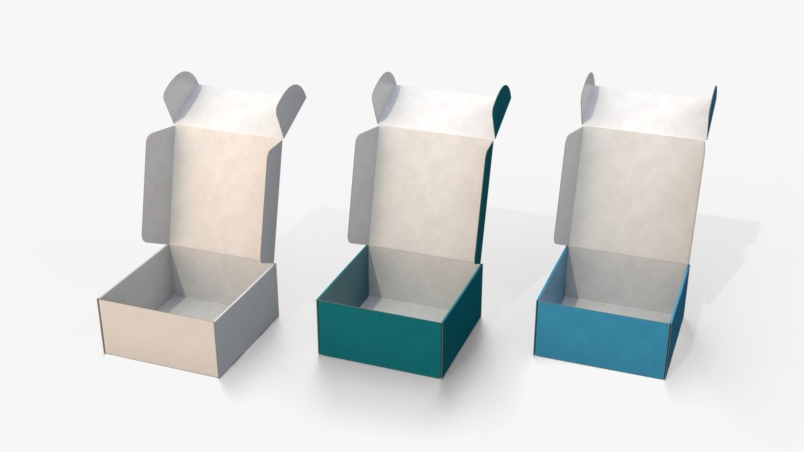
When a package shows up at the door, color is the first thing a customer notices. Before they read a logo or a label, they see a shape and a shade. For modern brands, especially those selling online, that moment is valuable. A colored mailer box turns an ordinary delivery into something people recognize and remember, and it does so without needing complicated design.
At The Boxology.US, we help brands use color as a practical part of their packaging. Here’s how colored mailer boxes work, how to choose the right colors, and what to plan for.
Why Color Works So Well on Mailer Boxes
Mailer boxes have large, simple surfaces. That makes them a natural canvas for color. A single bold shade can do more for recognition than a busy design, and it works well in photos and unboxing videos. Color also helps a package stand out among the plain brown boxes that arrive at most homes.
How Mailer Boxes Get Their Color
Printed Color on Kraft or White Board
Ink is printed over the surface of the box. On white board, colors tend to look brighter and truer. On kraft board, the brown base shows through and shifts the color, which can create a warmer, more natural look.
Solid Color Coverage
Brands that want a bold, uniform look can have the whole exterior printed in a single color. This looks striking, but large areas of solid color need careful printing to look even.
Colored Interiors
Printing the inside of the box adds a surprise when the customer opens it. A bright or contrasting interior is a simple way to add personality.
Color Accents
If you prefer a lighter touch, a colored logo, band, or pattern on a neutral box adds brand color with less ink coverage.
Choosing Colors for Your Brand
Color choices should reflect who you are and who you’re talking to. Some general associations people often make, though they vary by culture and context:
- Black and deep tones often suggest sophistication and premium quality
- White and soft neutrals often suggest cleanliness and simplicity
- Bright colors often suggest energy and playfulness
- Earthy greens and browns often suggest natural or sustainable products
- Pastels often suggest softness and gentleness
These are tendencies rather than rules. The best color is one that fits your brand and appears consistently across your website, products, and packaging.
Tips for Picking a Signature Color
- Start with your brand colors, so packaging matches everything else
- Consider your competitors, and think about whether a different shade helps you stand out
- Think about photography, since boxes are often photographed against different backgrounds
- Test in real light, because colors look different on screen and in person
- Keep it simple, since one strong color is often more memorable than several
Matching Interior and Exterior
A well-chosen interior can make a simple exterior feel special. Options include:
- A contrasting color inside for a lively reveal
- A matching color inside for a bold, unified look
- A soft neutral inside to let the product stand out
Coordinating tissue paper, inserts, or cards with the box color extends the experience.
Print Quality and Consistency
Color consistency matters, especially for brands that reorder. Ask your supplier about:
- Color matching, such as Pantone matching for your brand shades
- Sample approval, so you can confirm color before a full run
- Consistency across reorders, so boxes look the same over time
Small differences between batches can be noticeable, particularly with solid colors.
Practical Considerations
Cost
More ink coverage, more colors, and special matching can increase cost. A single color or simple accent keeps costs manageable.
Scuffing and Marks
Dark or solid colors can show scuffs and scratches more easily during shipping. Coatings can help, though you should test samples to see how they perform.
Shipping Labels
Plan space for shipping labels so your color and branding aren’t covered.
Recyclability
Heavy coatings or laminates can affect recycling. If sustainability matters to your brand, ask your supplier about inks and coatings, and confirm any claims you plan to make.
Colored Mailer Boxes for Different Types of Brands
Beauty and Skincare
Soft tones, deep neutrals, or a bold signature color can set the tone for the product experience.
Fashion and Apparel
Colored boxes make a strong visual statement and photograph well for unboxing content.
Subscription Boxes
A consistent color helps customers recognize the box every month.
Gifts and Seasonal Products
Seasonal colors or limited-edition shades add excitement and encourage sharing.
Small and Growing Brands
Even a simple color choice makes a brand look more established and memorable.
Common Mistakes to Avoid
- Choosing a color that doesn’t match the rest of the brand
- Using too many colors on one box
- Approving a color from a screen without a physical sample
- Forgetting how scuffs will show on dark boxes
- Covering the design with shipping labels
A Simple Colored Box Checklist
- ☐ Signature color chosen to match the brand
- ☐ Interior color planned
- ☐ Color matching confirmed with the supplier
- ☐ Physical sample reviewed in real light
- ☐ Space left for shipping labels
- ☐ Scuff and finish tested
- ☐ Coatings and inks checked if sustainability matters
How The Boxology.US Helps Brands With Colored Mailer Boxes
At The Boxology.US, we help brands bring color into their mailer boxes with care. Our services include:
- Custom sizes and mailer box styles
- Exterior and interior color printing
- Color matching for brand shades
- A range of finishes, including matte and gloss
- Free 3D mockups and physical samples before production
- Low minimum order quantities for growing brands
Color is one of the simplest and most powerful tools in packaging. With a thoughtful choice and careful printing, a colored mailer box makes every delivery feel like part of your brand.
Ready to add color to your packaging? Get a free quote from The Boxology.US today and start designing mailer boxes that stand out.