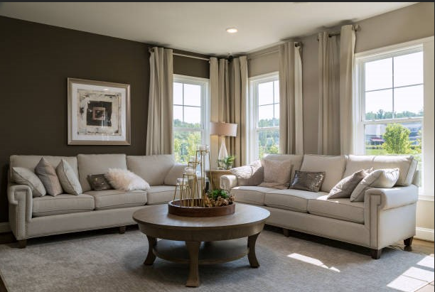
Decorating with neutral wall art is one of the easiest ways to create a calm, balanced space. It works across styles, from modern to traditional, and helps a room feel cohesive without overwhelming it. But choosing neutral art is not just about picking beige or gray. The real impact comes from how these tones are paired together.
Warm whites, taupes, and grays each bring a different feeling to a room. When combined thoughtfully, they create depth, softness, and visual harmony.
This guide explains the most popular neutral color pairings and how to use them effectively in your home.
Key Takeaways
- Neutral wall art creates balance and flexibility. It blends easily with different interior styles and evolves with your decor.
- Each neutral tone serves a purpose. Warm whites add softness, taupes bring depth, and grays introduce contrast.
- Pairing tones adds visual interest. Mixing neutrals prevents your space from looking flat or dull.
- Lighting affects how colors appear. Always consider natural and artificial light before choosing artwork.
- Style and space should guide your choice. Match your art with furniture, materials, and room size for a cohesive look.
Why Neutral Wall Art Works So Well
Neutral tones are versatile and timeless. Unlike bold colors, they do not dominate a space. Instead, they support the overall design and allow textures, furniture, and lighting to stand out.
Neutral wall art also adapts easily. You can update your decor without replacing your artwork, which makes it a practical long-term choice. Whether you prefer abstract wall art or landscape wall art, neutral tones help everything feel connected.
Understanding Warm Whites, Taupes, and Grays
Warm Whites
Warm whites are soft and inviting. They often have hints of cream, ivory, or beige. Unlike stark white, they feel comfortable and natural. These tones are widely used in neutral wall art because they create a calm base that works well in both modern and traditional interiors.
Taupes
Taupe sits between brown and gray. It is one of the most flexible neutral shades and can lean warm or cool depending on its undertones. Taupe is commonly seen in both abstract wall art and landscape wall art, where it helps add depth without making the design feel heavy.
Grays
Gray is a classic neutral that ranges from cool to warm. Lighter grays feel airy, while deeper grays add contrast. Gray tones are often featured in art prints online, especially for minimalist and contemporary designs.
Popular Neutral Wall Art Color Pairings
Warm White and Soft Taupe
This is one of the most popular combinations in Neutral Wall Art. Warm white keeps the space light, while taupe adds subtle depth. This pairing works especially well in landscape wall art, where natural tones blend effortlessly.
Taupe and Warm Gray
Taupe and warm gray create a balanced, modern feel. The mix of earthy and cool tones adds interest without overpowering the space. This combination is often used in abstract wall art to create layered, textured visuals.
Warm White and Light Gray
This combination feels clean and fresh. It is perfect for creating a bright, airy look without going too stark. Many framed prints online feature this pairing because it suits a wide range of interiors.
Deep Gray and Soft White
For those who want more contrast, deep gray paired with soft white adds definition without being too bold. This pairing works well in bold yet minimal neutral wall art collections.
Choosing the Right Pairing for Your Space
Lighting
Natural light changes how neutrals appear. Warm whites look richer in sunlight, while grays can appear cooler. When selecting art prints online, consider how lighting will affect the tones in your space.
Furniture and Materials
Look at your existing decor. Wood tones, fabrics, and finishes should guide your choice. Coordinating your neutral wall art with furniture helps create a cohesive and well-balanced room.
Room Size
Lighter combinations make small spaces feel bigger, while darker tones add depth to larger rooms. Choosing the right scale and tone is especially important when buying framed prints online, so the artwork fits the space naturally.
Conclusion
Neutral wall art is more than a safe decor choice. It is a simple way to bring calm, depth, and harmony into your home. Warm whites, taupes, and grays each add something different, from softness to contrast.
When layered with the right lighting, furniture, and textures, these tones keep a room from feeling plain. Because neutral palettes are timeless and versatile, they work beautifully with many styles and materials. Choose the right pairing, and your space will feel balanced, inviting, and complete.
FAQs
How do I know if a neutral tone is warm or cool?
Check undertones. Warm tones lean beige or yellow, while cool tones lean blue or gray.
Can I mix different neutral palettes?
Yes, but keep a consistent base tone for harmony.
What frames work best?
Black, white, wood, and gold frames all complement neutral tones.
Is neutral wall art good for bold interiors?
Yes, it balances strong colors and keeps the space grounded.
How often should I update it?
Neutral art lasts for years and does not need frequent updates.